Note
Go to the end to download the full example code or to run this example in your browser via Binder
Binning#
Binning2D#
Statistical data binning is a way to group several more or less continuous values into a smaller number of bins. For example, if you have irregularly distributed data over the oceans, you can organize these observations into a lower number of geographical intervals (for example, by grouping them all five degrees into latitudes and longitudes).
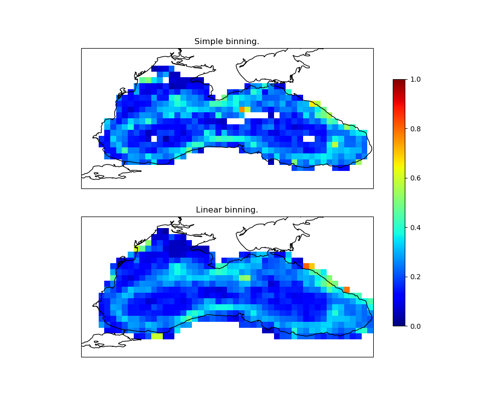
In this example, we will calculate drifter velocity statistics on the Black Sea over a period of 9 years.
import cartopy.crs
import matplotlib
import matplotlib.pyplot
import numpy

import pyinterp
import pyinterp.backends.xarray
import pyinterp.tests
The first step is to load the data into memory and create the interpolator object:
ds = pyinterp.tests.load_aoml()
Let’s start by calculating the standard for vectors u and v.
Now, we will describe the grid used to calculate our binned statistics.
binning = pyinterp.Binning2D(
    pyinterp.Axis(numpy.arange(27, 42, 0.3), is_circle=True),
    pyinterp.Axis(numpy.arange(40, 47, 0.3)))
binning
<pyinterp.binning.Binning2D>
Axis:
  x: <pyinterp.core.Axis>
  min_value: 27
  max_value: 41.7
  step     : 0.3
  is_circle: false
  y: <pyinterp.core.Axis>
  min_value: 40
  max_value: 46.9
  step     : 0.3
  is_circle: false
We push the loaded data into the different defined bins using simple binning.
Note
If the processed data is larger than the available RAM, it’s possible to use
Dask to parallel the calculation. To do this, an instance must be built,
then the data must be added using the push_delayed method. This method will return a graph,
which when executed will return a new instance containing the calculated
statistics.
It is possible to retrieve other statistical variables such as variance, minimum, maximum, etc.
nearest = binning.variable('mean')
Then, we push the loaded data into the different defined bins using linear binning.
We visualize our result
fig = matplotlib.pyplot.figure(figsize=(10, 8))
ax1 = fig.add_subplot(211, projection=cartopy.crs.PlateCarree())
lon, lat = numpy.meshgrid(binning.x, binning.y, indexing='ij')
pcm = ax1.pcolormesh(lon,
                     lat,
                     nearest,
                     cmap='jet',
                     shading='auto',
                     vmin=0,
                     vmax=1,
                     transform=cartopy.crs.PlateCarree())
ax1.coastlines()
ax1.set_title('Simple binning.')

ax2 = fig.add_subplot(212, projection=cartopy.crs.PlateCarree())
lon, lat = numpy.meshgrid(binning.x, binning.y, indexing='ij')
pcm = ax2.pcolormesh(lon,
                     lat,
                     linear,
                     cmap='jet',
                     shading='auto',
                     vmin=0,
                     vmax=1,
                     transform=cartopy.crs.PlateCarree())
ax2.coastlines()
ax2.set_title('Linear binning.')
fig.colorbar(pcm, ax=[ax1, ax2], shrink=0.8)
fig.show()
Histogram2D#
This class, like the previous one, allows
calculating a binning using distribution and obtains the median value of the
pixels. histograms. In addition, this approach calculates the quantiles of the
Note that the algorithm used defines a maximum size of the number of bins handled by each histogram. If the number of observations is greater than the capacity of the histogram, the histogram will be compressed to best present this distribution in limited memory size. The description of the exact algorithm is in the article A Streaming Parallel Decision Tree Algorithm.
hist2d = pyinterp.Histogram2D(
    pyinterp.Axis(numpy.arange(27, 42, 0.3), is_circle=True),
    pyinterp.Axis(numpy.arange(40, 47, 0.3)))
hist2d
<pyinterp.histogram2d.Histogram2D>
Axis:
  x: <pyinterp.core.Axis>
  min_value: 27
  max_value: 41.7
  step     : 0.3
  is_circle: false
  y: <pyinterp.core.Axis>
  min_value: 40
  max_value: 46.9
  step     : 0.3
  is_circle: false
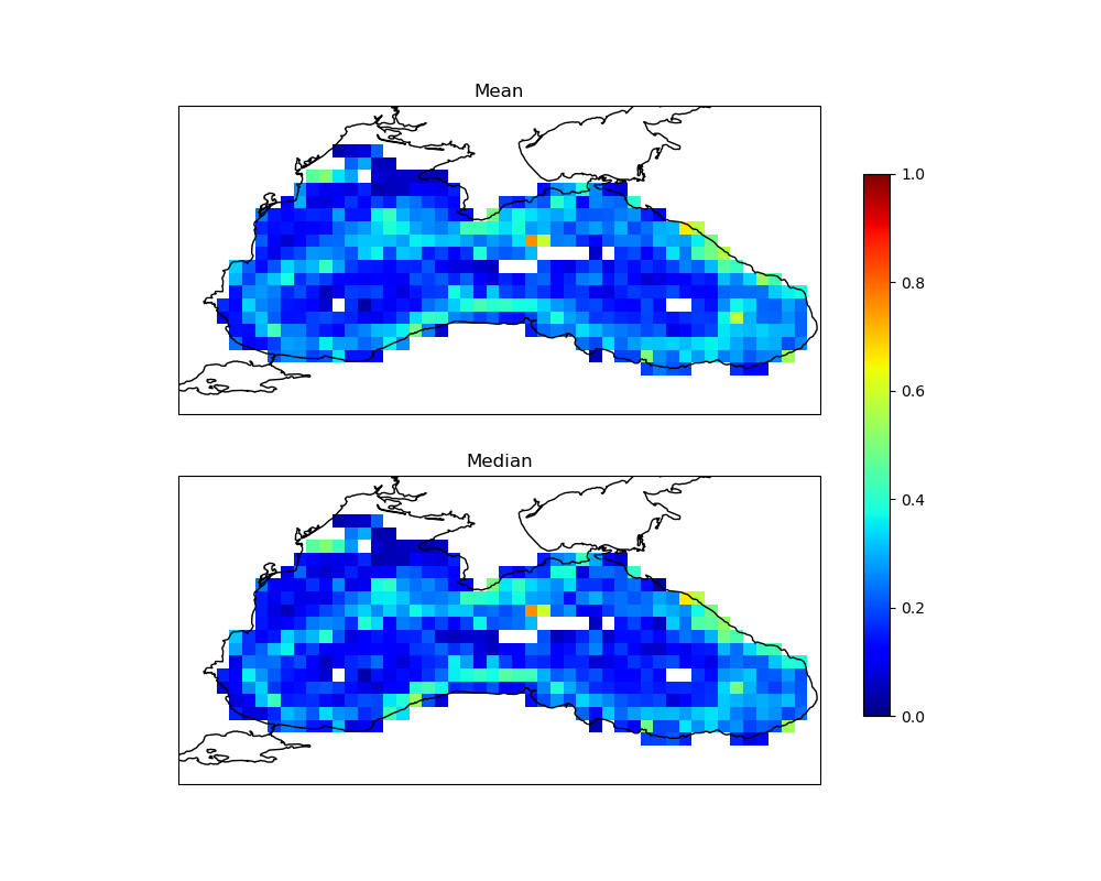
We push the loaded data into the different defined bins using the method
push.
We visualize the mean vs median of the distribution.
fig = matplotlib.pyplot.figure(figsize=(10, 8))
ax1 = fig.add_subplot(211, projection=cartopy.crs.PlateCarree())
lon, lat = numpy.meshgrid(binning.x, binning.y, indexing='ij')
pcm = ax1.pcolormesh(lon,
                     lat,
                     nearest,
                     cmap='jet',
                     shading='auto',
                     vmin=0,
                     vmax=1,
                     transform=cartopy.crs.PlateCarree())
ax1.coastlines()
ax1.set_title('Mean')

ax2 = fig.add_subplot(212, projection=cartopy.crs.PlateCarree())
lon, lat = numpy.meshgrid(binning.x, binning.y, indexing='ij')
pcm = ax2.pcolormesh(lon,
                     lat,
                     hist2d.variable('quantile', 0.5),
                     cmap='jet',
                     shading='auto',
                     vmin=0,
                     vmax=1,
                     transform=cartopy.crs.PlateCarree())
ax2.coastlines()
ax2.set_title('Median')
fig.colorbar(pcm, ax=[ax1, ax2], shrink=0.8)
fig.show()
Total running time of the script: (0 minutes 1.715 seconds)